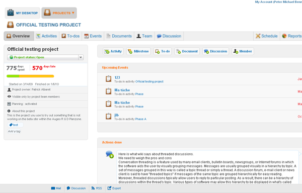
In the quest for "less is more" and that a drawing should have no unnecessary lines, we are introducing the new Air Theme for Planzone. If you want to try it, go to My Account / My Themes and click on the Air thumbnail.
This is a first attempt at lightening up the interface to make it less busy for the user, reduce the noise level and make the useful content more obvious. We hope it allows you to get your work done just a little bit quicker.

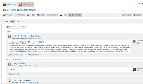
The first thing you will probably notice is that we removed most of the blue shading, replacing it with a lot of white space and soft grays. But we also removed the 3D effects in buttons and toolbars, removed heavy border lines and even added a few discreet border lines where the clickable object was considered to be a little unclear or "fuzzy" on the white background. We changed most instances of "all-capitals" text to a normal script in tabs as well as buttons.
In the Discussion tab, for instance, we find the new theme delineates better the discussion topics from each other.

An additional small benefit for the user is a faster loading of the screens in the browser without all the images, as well as allowing our R&D team to spend less time on adjusting small graphical imperfections throughout the product.
We plan to make further GUI and workflow improvements in the months to come, and very much appreciate any feedback you may want to send us at support@planzone.com
Your Planzone team